
Colour consultancy
An independent perspective on colour.
Colour doesn’t exist in a vacuum. It interacts with architecture, materials, light, art, and the experience of a space. Sometimes, it just needs someone who gets it—without overcomplicating things.
That’s where I come in.
01 — Architecture & interiors
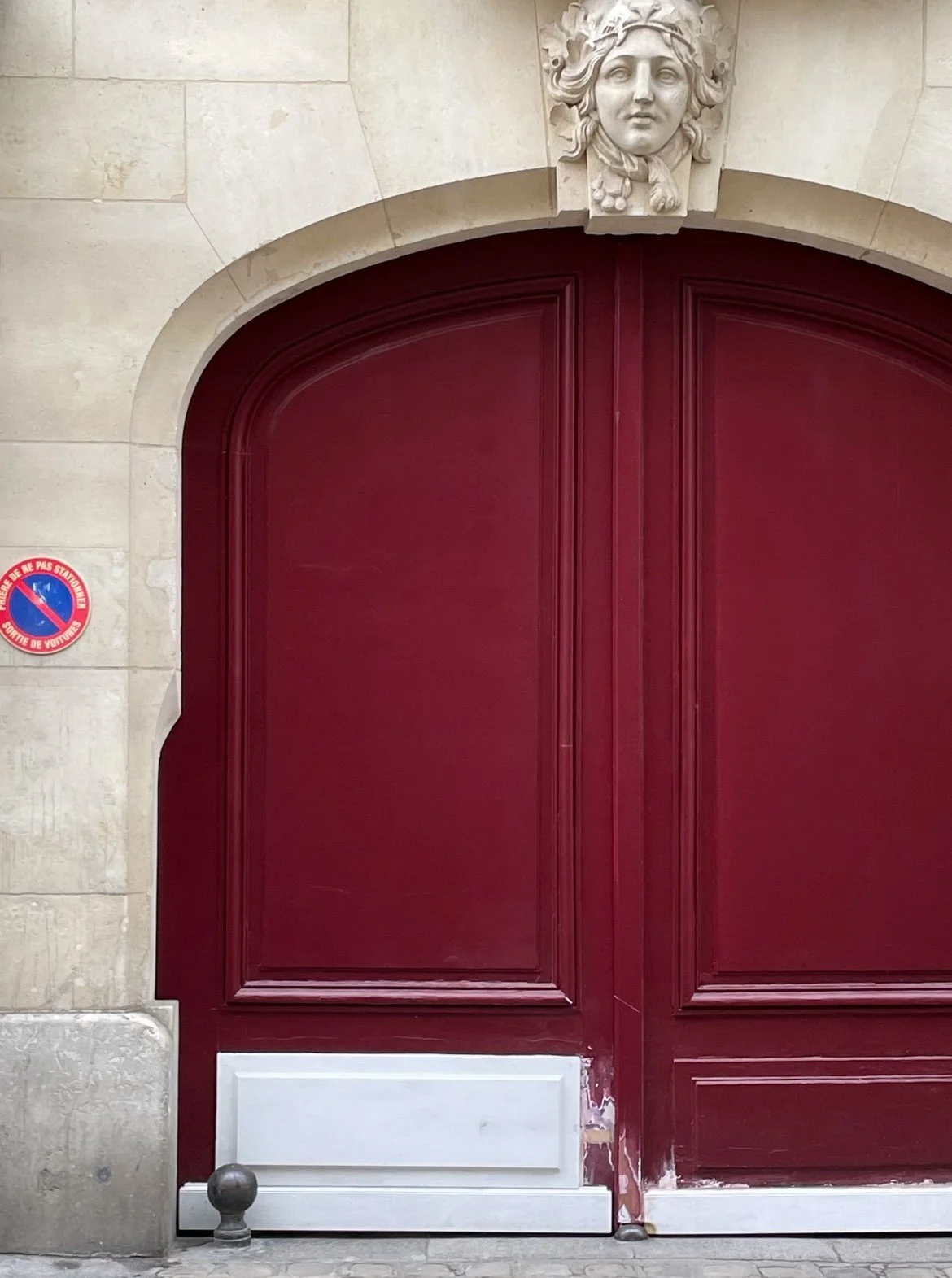
Colour, the silent architect.
Colour doesn’t just decorate—it defines. It can sharpen a space’s character, tie materials together, or shift the mood of a room entirely.
I work with architects and interior designers to explore, test, and refine colour in relation to architecture, materials, finishes, and light. No rigid rules. Just intuition, experience, and a sharp eye.
This can include:
Nailing a colour direction that aligns with the vision
Crafting or refining a palette tailored to the project
Testing colours against materials and finishes
Assessing the impact of natural and artificial light
Reviewing colour schemes for coherence and impact
Resolving specific colour challenges
For those who see colour as part of the design process—not just an afterthought.
02 — Cultural spaces & scenography
Colour in service of the art.
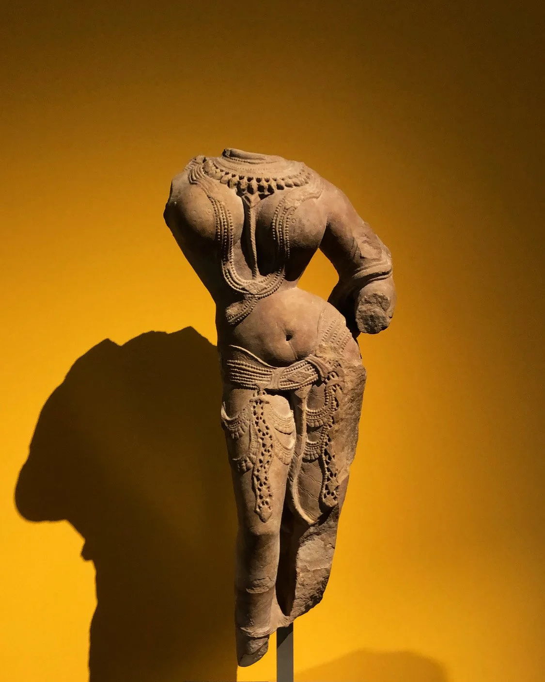
In a museum, gallery, or exhibition, colour sets the stage. It creates the environment that allows the art to breathe and the visitor to engage.
I collaborate with museums, galleries, exhibition designers, and scenographers to develop, test, and refine colour in relation to the artworks, architecture, lighting, and visitor experience. My approach is simple: what serves the work and the audience best.
This can include:
Shaping an exhibition colour direction that complements the narrative
Creating and refining wall colour palettes that enhance without competing
Assessing colour alongside artworks—because context is everything
Reviewing proposed colour choices with a discerning eye
Considering architecture and light—and how they interact with the art
Advising on paint colour and finish—because every detail contributes to the experience
Reviewing colour decisions as the exhibition evolves
The goal? Not to make the walls interesting. To make the art and the experience unforgettable.
03 — Colour review
Sometimes you just need a fresh perspective.
You have a palette. You have ideas. But you’d like another pair of eyes to confirm—or challenge—your choices.
A colour review is a focused assessment of your existing or proposed colour decisions, whether for architecture, interiors, exhibitions, or finishes.
Useful when you need to:
Test a proposed palette—does it truly work?
Compare colours against materials or artworks—because seeing is believing
Resolve a tricky colour decision—the kind that lingers
Challenge an assumption—because sometimes, the obvious isn’t the answer
Make a final choice with confidence
Sometimes, one conversation is all it takes.
How I work
No fixed formula. No one-size-fits-all approach.
I can join a project at the beginning (when the colour direction is still a blank canvas), during development (when things are taking shape), or towards the end (when a few decisions still need resolving).
My involvement depends on what you need.
What I bring? An independent eye—and the willingness to share honest insights. No fluff. Just clarity.